Price/Cash Flow
Technology Stocks: Dance Like Nobody’s Watching
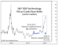
In the middle of the last decade, we marveled at the Tech sector’s ability to flog the rest of the market quarter after quarter, with no meaningful breakout in valuations. Specifically, the median Price/Cash Flow ratio for S&P 500 Technology managed to “hug” the 15x level for about four years beginning in late 2013. Tech’s post-COVID boom is nothing of the sort.
What’s Ailing Consumer Staples?
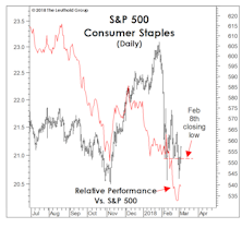
For the first time in this bull market, defensive stocks failed to provide any semblance of defense during a market correction.
Value: Scarcer Than In 2000
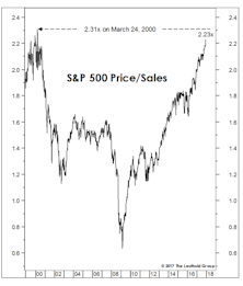
Comparing current valuations to March 2000 is unfair to March 2000. Any Value or Small Cap manager from that era can attest that values became more plentiful as the S&P ascended into its narrow peak.
Valuation "Gut Check"
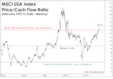
While our most reliable valuation work is based on the S&P 500 (and closely-related S&P Industrials Index), we monitor several other measures for substantiation and reinforcement.
Discretionary: Is The Top Finally In?
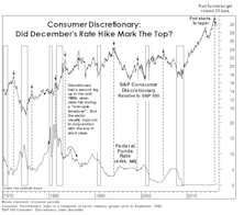
Sector swings have been wild enough thus far in 2016 that Consumer Discretionary’s relative weakness has drawn little commentary.
Estimating The Downside - March 2014
BACK TO THE MEDIANS (1957 To Date): S&P 500 13% Downside
The S&P 500 gained 4.3% (price only) in February. Based on the 1957-to-date valuation metrics presented below, the S&P 500 has 13% downside to its historical average. The S&P Industrials (which excludes Utilities and Financials) now has 26% downside to reach mean valuation.
Valuing The “Typical” Stock
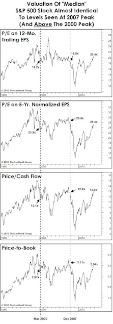
Current median valuations are almost identical to those seen at the bull market highs of March 2000 and October 2007.
Comparing Common Stock Cash Flow Yields to Bond Yields: The Ratio

Comparing cash flow yields with bond yields we find that stocks are not significantly overvalued compared to bonds. Stocks are not yet comparatively cheap, but they come out much better in this stock/bond comparison than in the dividend yield/bond yield comparisons or in the earnings yield/bond yield comparisons.
Comparing Common Stock Cash Flow Yields to Bond Yields

We thought last month might be the end of this bond/stock comparative series. However, a recent note from a client has prompted us to undertake an additional study comparing common stock cash flow yields with bond yields.
Scanning The Markets
The following table is a performance run down for our sectors, including experimental sectors like The Texas Sector. The Water Thesis, which was activated this month, was another experimental sector. All screen based Quantitative Themes are included, both active and experimental. The table contains a number of stock market averages for comparative purposes as well as bond sectors and gold. The whole list is ranked by January performance (excluding income) with three month and twelve month performance also included.
Perception for the Professional
March 2026 Issue

Featured Articles
Sector Navigator
March 2026 Issue